0
Reputation
3
Posts
1
Profile views
0
Followers
0
Following
Best posts made by juwairiah.agz
This user does not have any upvoted posts yet.
Latest posts made by juwairiah.agz
RE: Data Analytics Complete Reskill Certificate Program- Yayasan Peneraju(12.12.2023 to 21.12.2023)
posted in Data Analytics •
My journey into data analytics and R programming begins when I apply for an upskill program at AirAsia academy and finally gets the opportunity to join the classes. I would say that this journey here is valuable for me because Dr. Sara has the gift of explaining the theoretical and practicality of data analytics and R programming very well. I like her intonation when she is teaching in the class where her tone is tone monotone and she knows how to make us as a student of a complete beginner to pay attention. Moreover, her storytelling style helps us as a student to grasp the info very well.
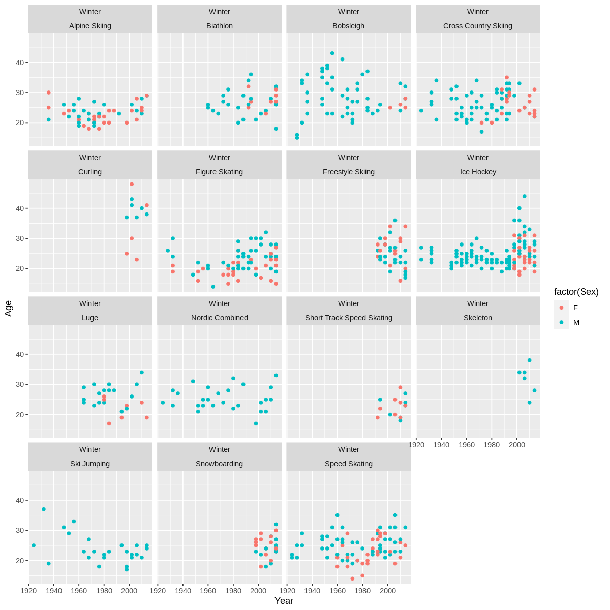
Specific moments that stand out are when I was assigned in a team, and we have to complete a mini R project. The project is due in less than 24 hours after we have learnt the theory and practical terms of R programming using Google Collaborators. We as a team chose the Olympic dataset to work on our mini R project.
We changed our problem statement a few times because we weren’t sure which columns, we can use to relate the data to the graph that will be plotted later on using ggplot. However, it’s fascinating we get to delved into the world of Winter Olympics. We as a team specifically decided to focus on the participation of male and female athletes from the United States during the winter seasons.
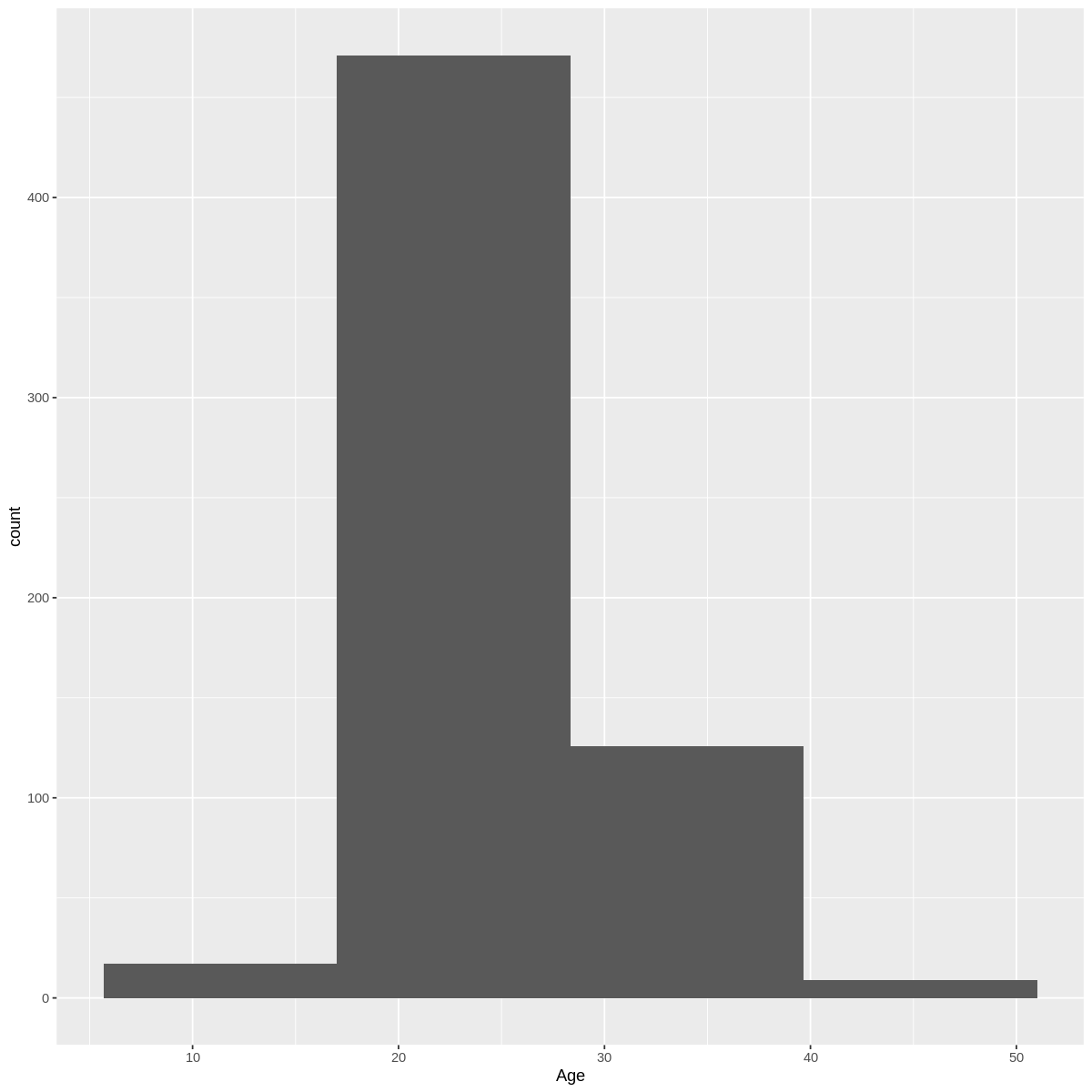
There were missing values in the 70000 columns Age, Height, and Weight, therefore we decided to replace the missing values by average.
Next, we convert the categorical column into factor to check if there are any missing values in the Sex, Season, Sport, City, and NOC.
Initially, the olympic dataset has around 70000 columns data but we narrow down the data to USA during winter only and print the new data which is usa_winter_data by using this command below in R:
usa_winter_data <- subset(olympictable,NOC=="USA" & Season=="Winter")
To remove the unwanted table, we use the command library(dplyr) and create a new OLympic table with which data we want to focus on which is Sex, Age, NOC, Year, Season, City and Sport.
Further data cleaning was done by finding the duplicated values in a new Olympic table and removing the duplicate values. The new data is checked again to see there are no duplicates.
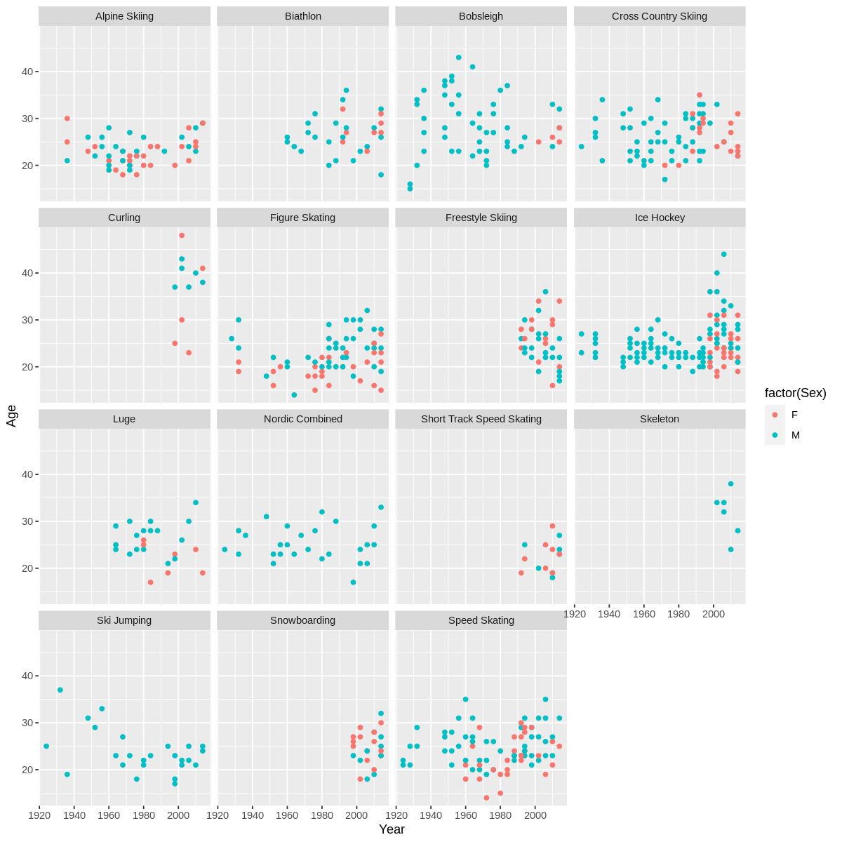
Data Visualization is the last goal to achieve in this mini R project, I would say this part is the most challenging because there are variables that we need to plot and find hypothesis. In most cases, when plotting a graph using R, the numerical value is typically placed on the y-axis, representing the dependent variable, while the categorical value is placed on the x-axis, representing the independent variable. However, it’s important to note that there are situations where the axes can be switched depending on the specific analysis or visualization we want to achieve. The choice of the variable depends on which axis is the challenging part as it depends on the nature and the goal of our graph.
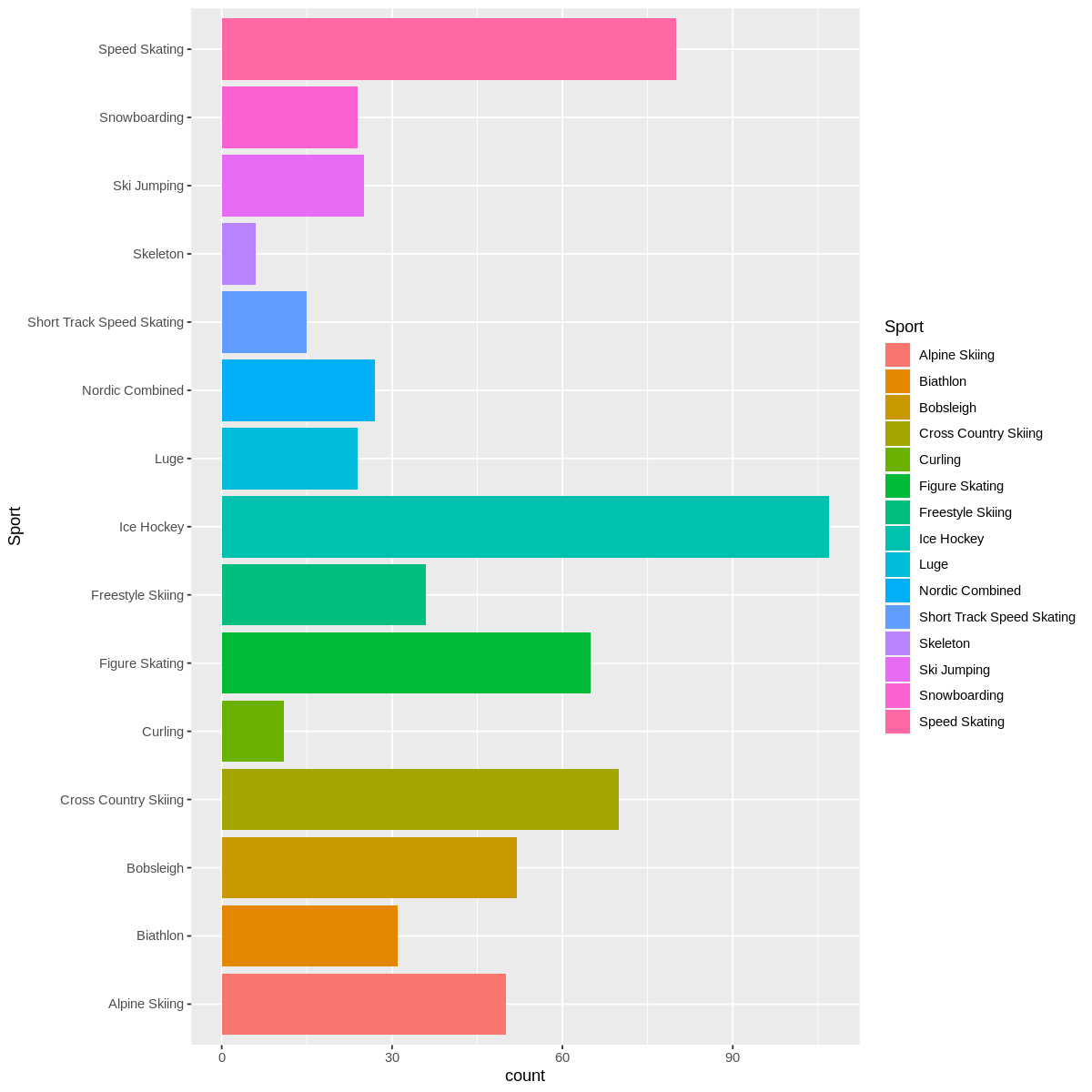
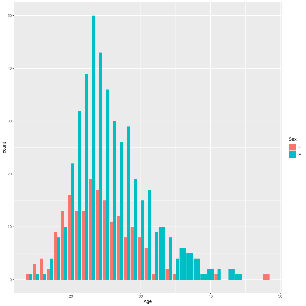
Four Variable (Two Numerical & Two Categorical)
-
During the Winter Olympics, there is a higher representation of male athletes compared to female athletes from USA.
-
There are three sports where male athletes have a significant presence
i.e Ski jumping,Skeleton,Nordic Combined
Five Variables