Projects on Data Analytics Using R
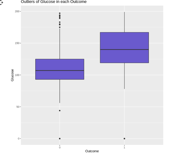
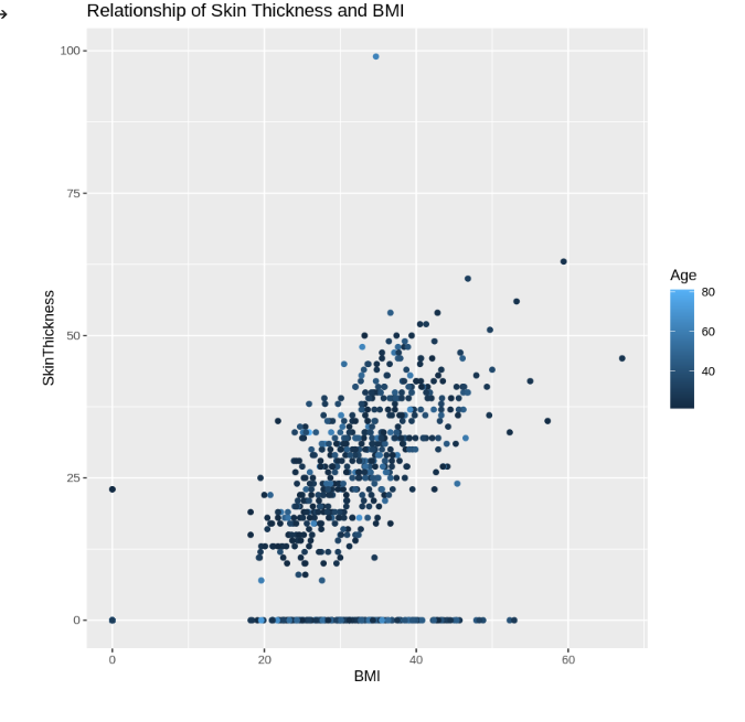
Our data is to predict whether a patient has diabetes based on certain diagnostic measurements included in the dataset. We use ggplot to investigate the relationship between skin thickness and BMI, total people per outcome, relationship of BMI and blood pressure and outliers of glucose in each outcome.
We use Logistic Regression Algorithms
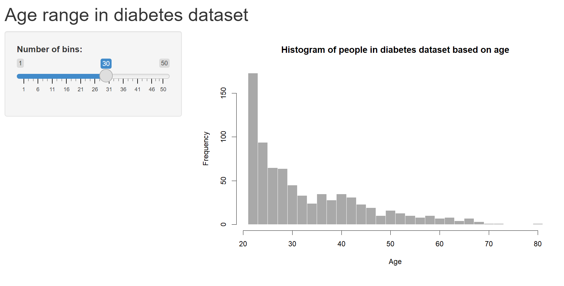
and below is our dashboard using R Shiny App
Lastly our super Trainer Dr. @saranyaravikumar , she made the learning experience fun and interesting! . So full of effort to teach all of us. Thank you again Dr!!

@saranyaravikumar
The dataset is on brain stroke prediction.
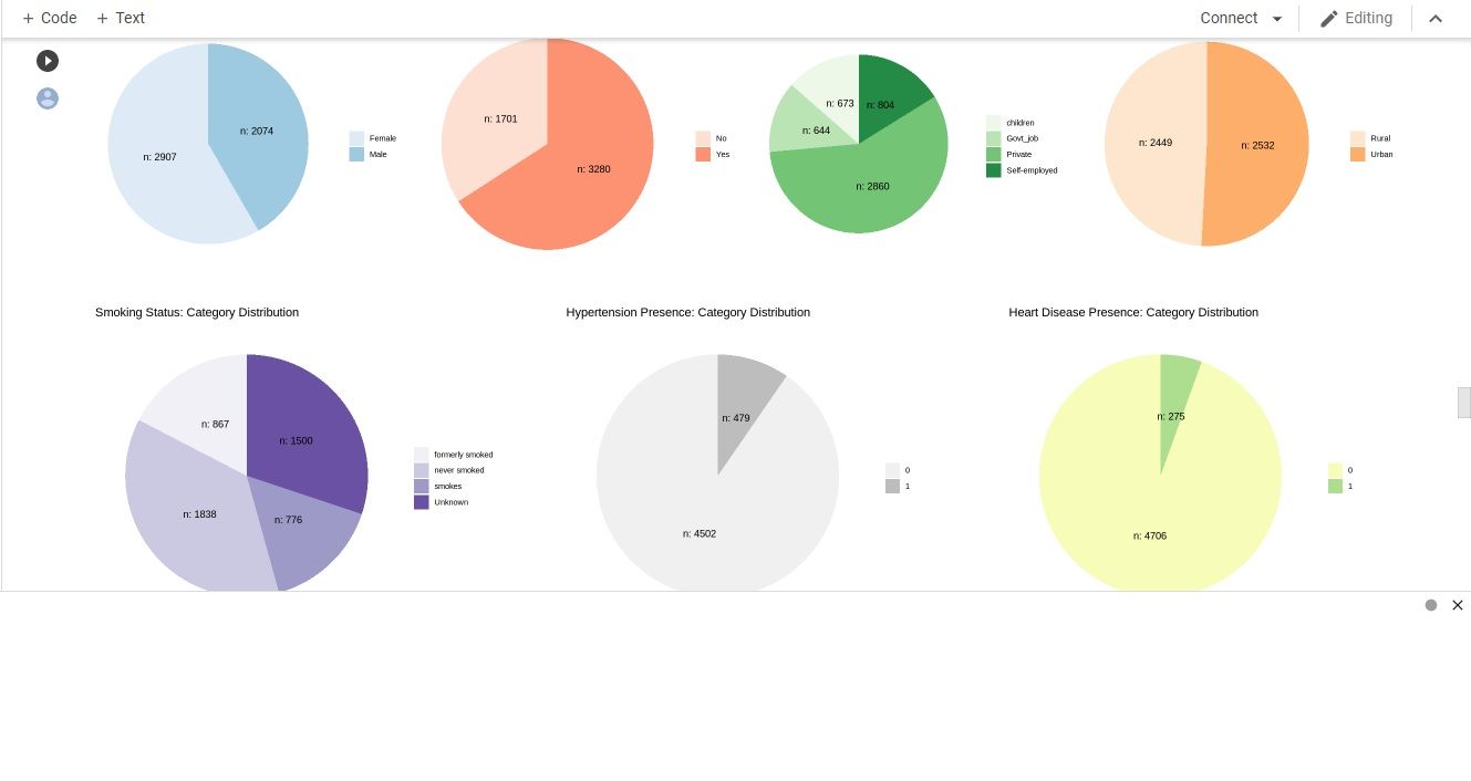
Next, we visualize the data using pie chart to see the proportion of stroke among the categorical data.
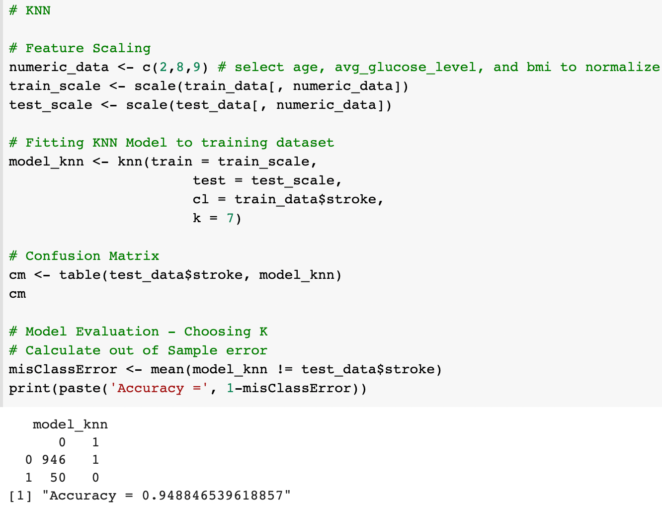
For ML algorithm, we chose to use logistic regression, decision tree and KNN. The reason why is, the data is too limited to make a solid conclusion. It does not represent the whole population.
You can view the codes on Google Colab
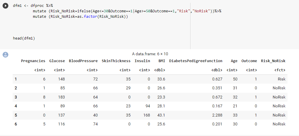
I was in Group 314 and our data set is about Diabetes. I have zero coding or programming knowledge and was able to learn the topics with the help of Dr. Sara and classmates.
This coding that I would like to share is about mutating the original Diabetes data frame with a new column that will indicate the Risk level of the patient based on a few conditions which are Age and Outcome. This coding that I wrote was able to run after consulting with Dr. about it.
Thank you to Dr. Sara and all the classmates!
-
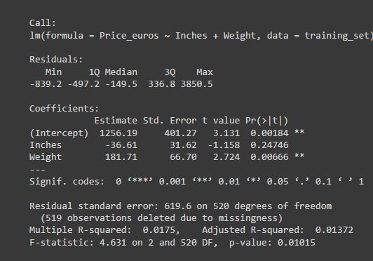
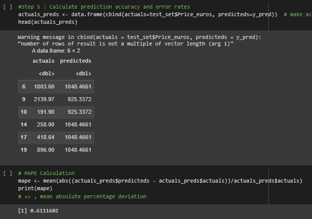
The data that we were working on is about laptop prices in euros with a few variables.
-
The data is visualized as a bar plot below.
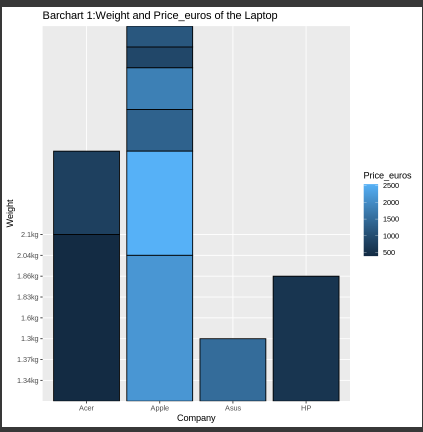
-The findings can be conclude as Company Apple has higher price despite being heavy while Company Acer and HP has lower prices despite being almost similar laptop weight as Apple company
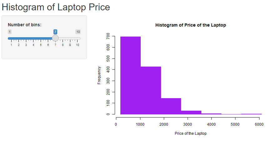
- The ML algorithm used is supervised (Multiple Linear Regression) because the dataset has more than one input and only has one continuous numerical target.
Thank you @saranyaravikumar
Group HENN; Mini Project Group – Real estate.
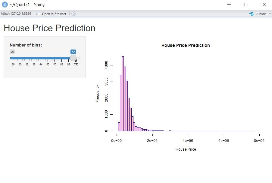
Our data is about real estate. We predicted the price of houses based on the given input variables, which consist of house age, distance to the nearest MRT station, number of convenience stores, latitude and longitude. Then, we visualize our data using ggplot to see if there are any relationships among the variables.

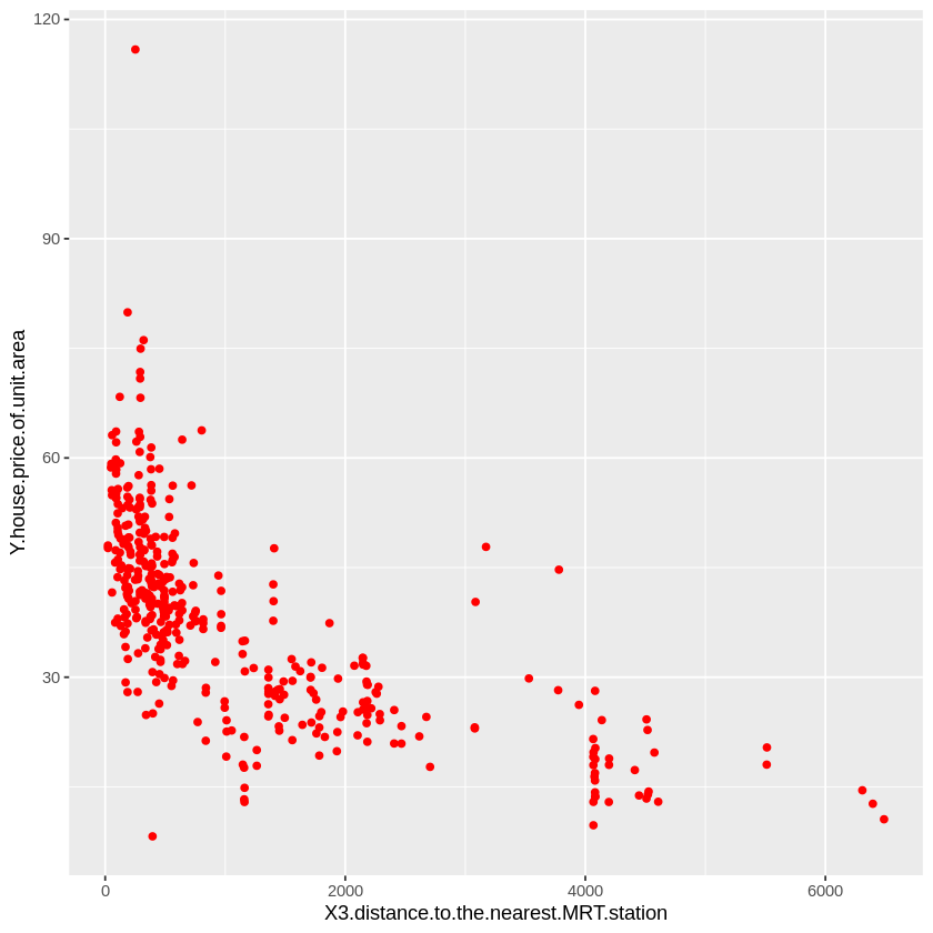

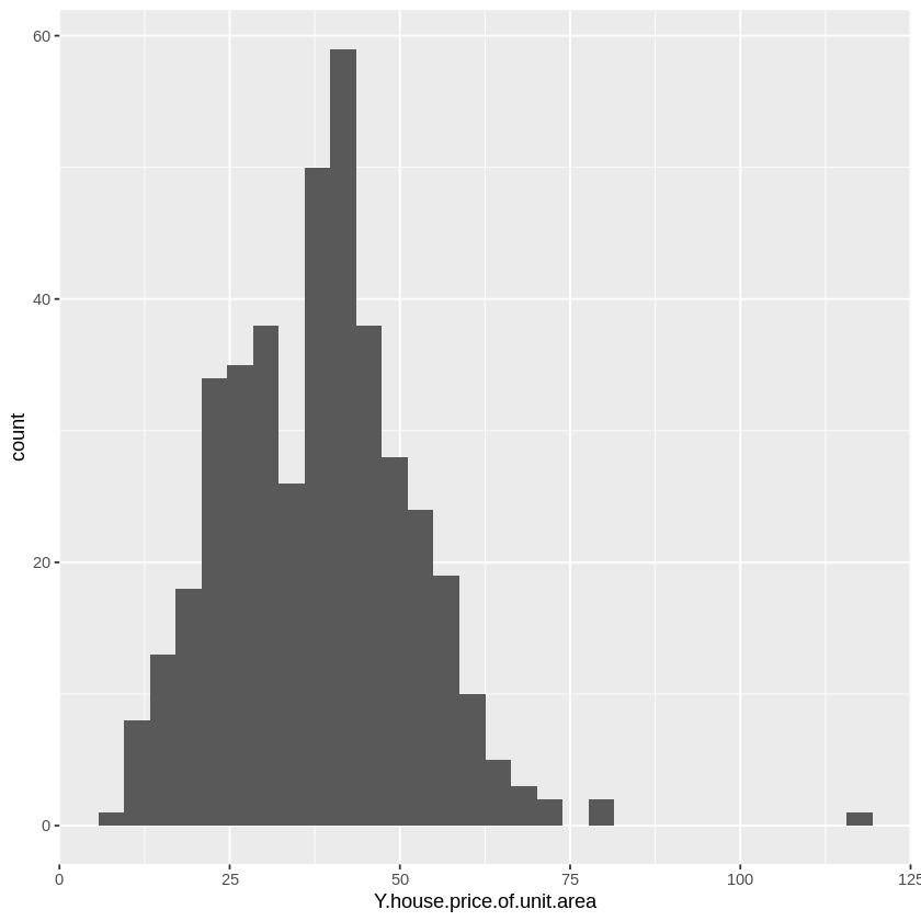
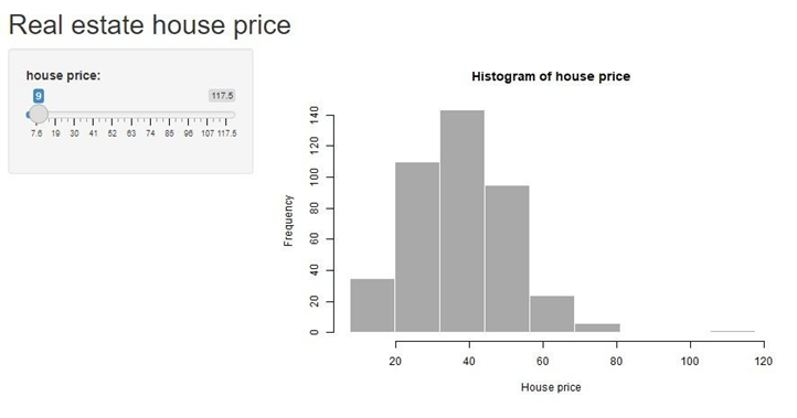
After that, we use multiple linear regression to analyse our data as we have more than one input. We found that the number of convenience stores is positively correlated with the house’s price, while the house’s age and the distance of the house to the nearest MRT station are negatively correlated with the house’s price. Lastly, this is a sample of the web app created using R Shiny.
Thank you Dr.
-
The data that we were working on is about laptop prices in euros with a few variables.
-
The data is visualized as a bar plot below.

-The findings can be conclude as Company Apple has higher price despite being heavy while Company Acer and HP has lower prices despite being almost similar laptop weight as Apple company
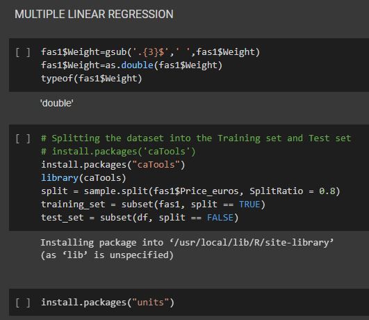
- The ML algorithm used is supervised (Multiple Linear Regression) because the dataset has more than one input and only has one continuous numerical target.

Group name: HIJAU
Data: Car selling price prediction
-
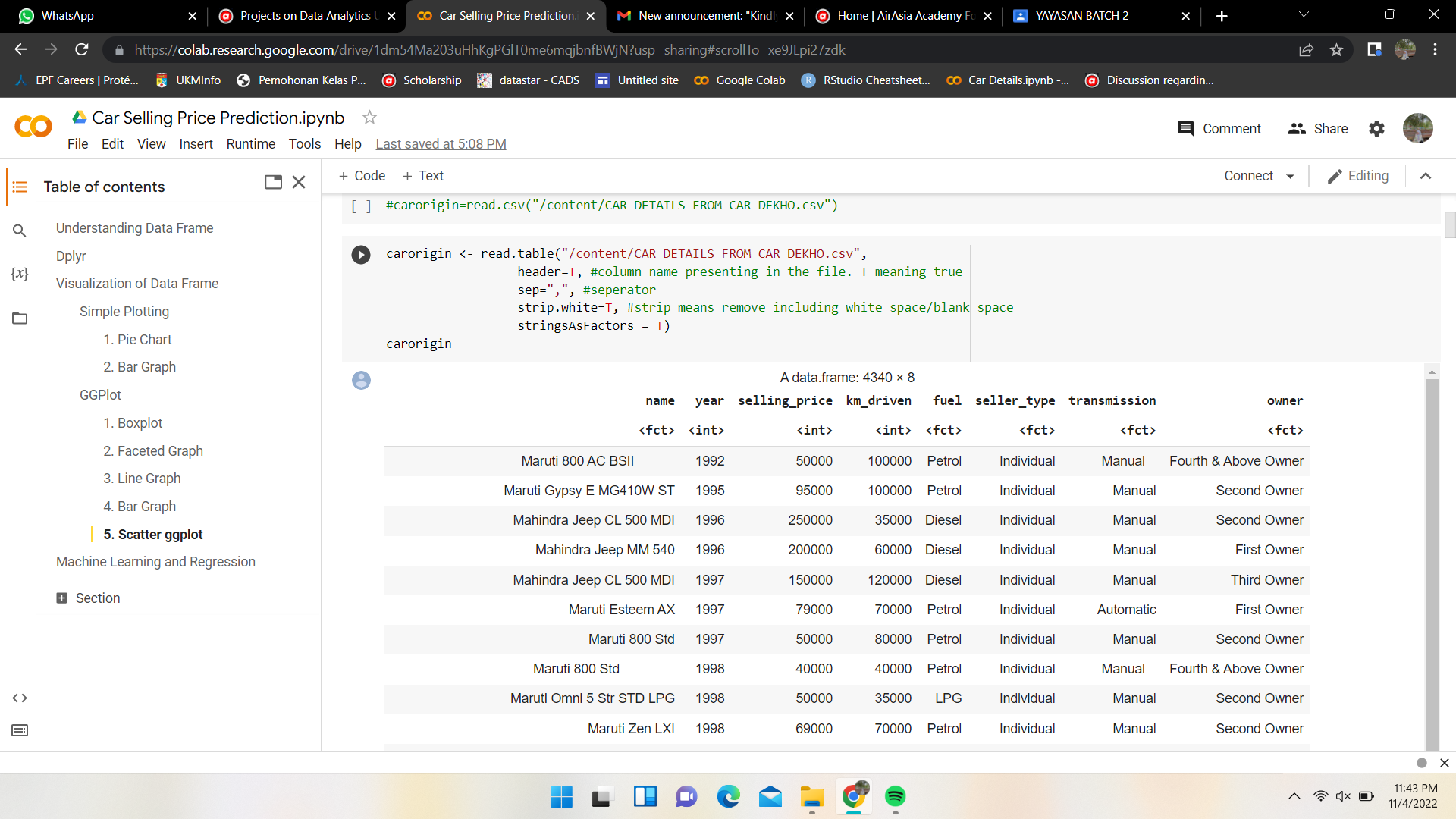
Our data is about the car details at Car Dekho. Car Dekho is a website that acts as mediator between seller and buyer. The car details are name of the car, year released of the car, selling price, km driven, fuel, seller type, transmission and owner.
-
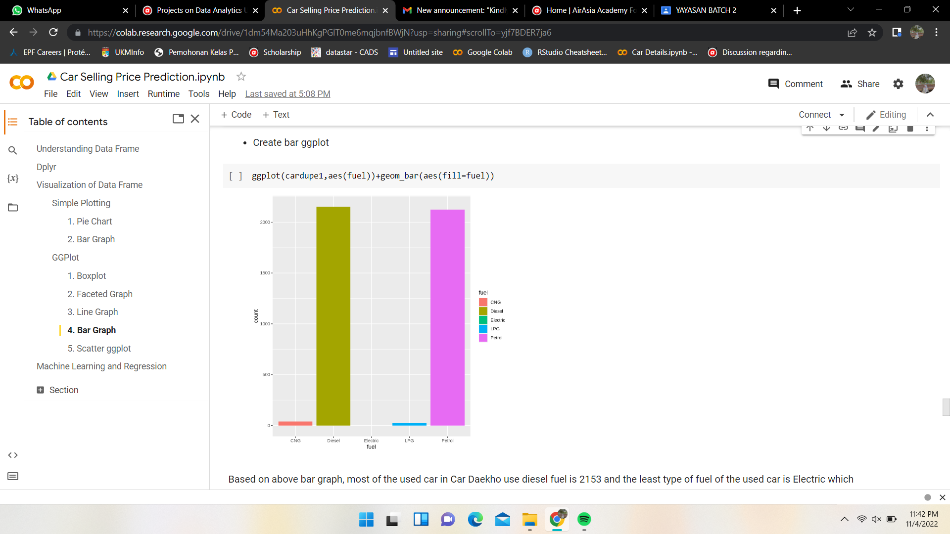
We visualize the data using pie chart, bar graph, line graph, box plot and scatter plot.
-
The ML algorithm that we use is regression because the target column is continuous numerical data. Hence, there are many input and only one output.
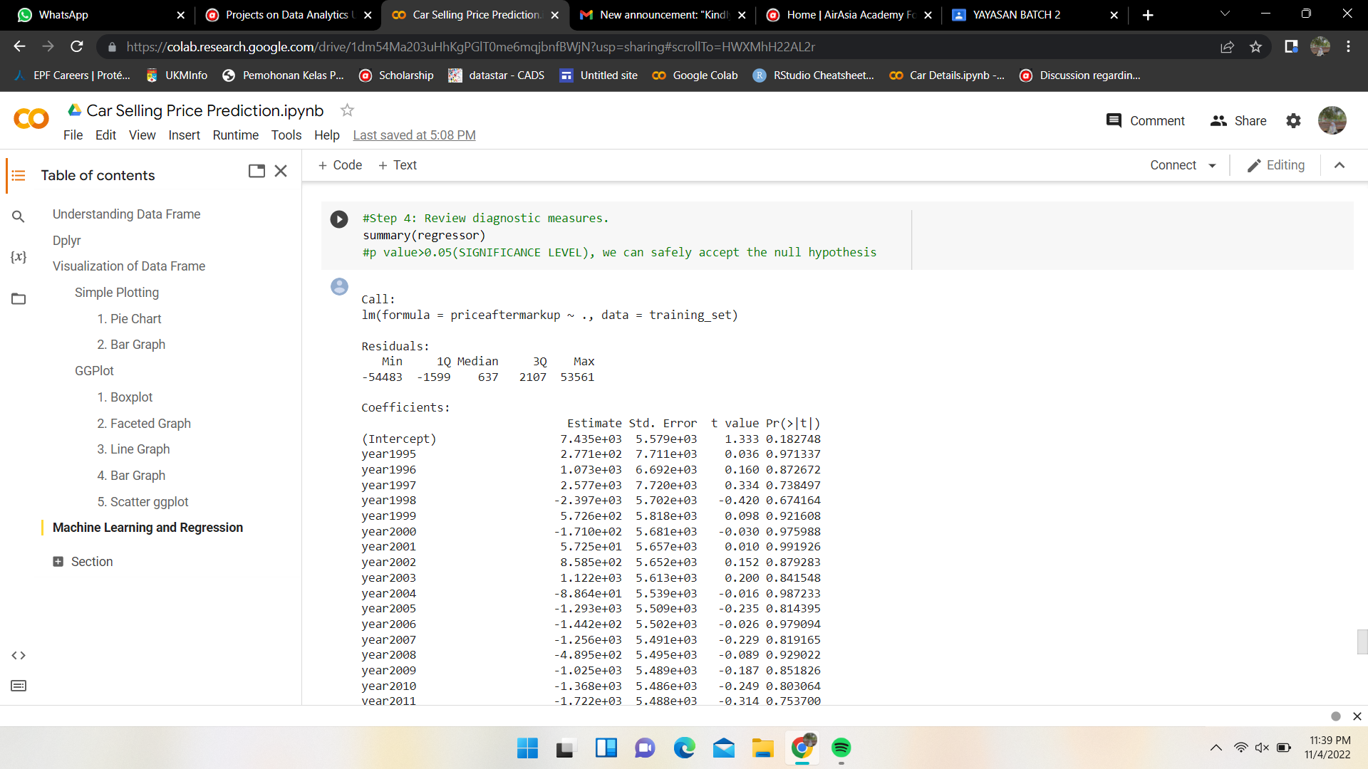
group: HIJAU
We are using data of car details at Car Daekho. Car Daekho is a website that sells used car and based in India which This data contains 8 variables.
For one of our analysis. We want to see the average of selling price for different type of owner. Therefore, we use group by keyword to group the owner column so we can extract the means for each type owner.
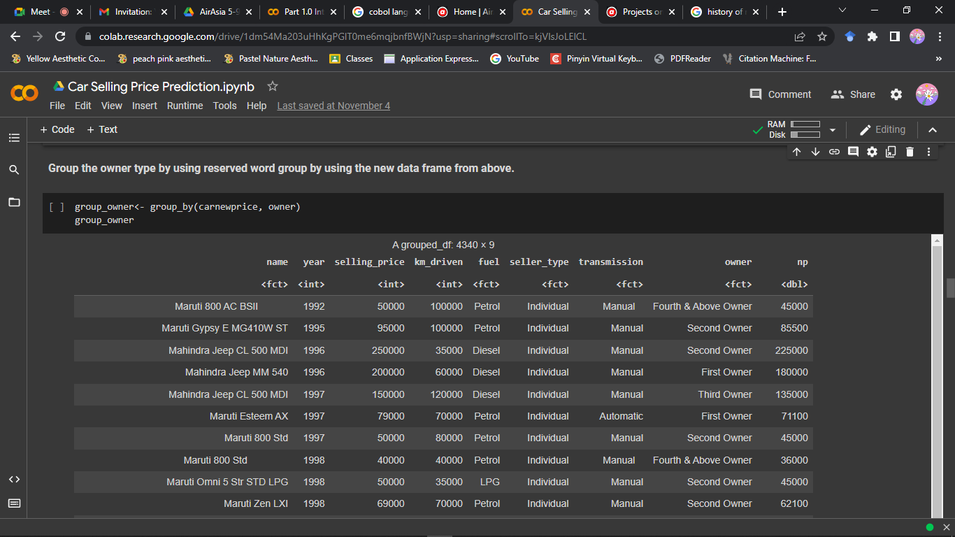
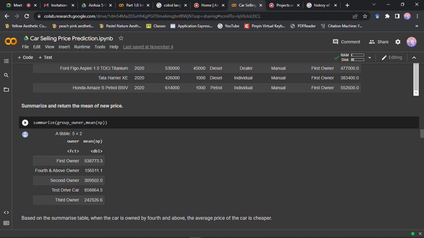
As seen in the last picture, we can see that used car that have first owner has the highest average selling price that others.
We are using KC House dataset. In this analysis, we cleaned and filtered the data and finally chose to focus on the price, zipcode(location of the property), no of bedrooms, size of the property(sqft_lot), and the view of the area.
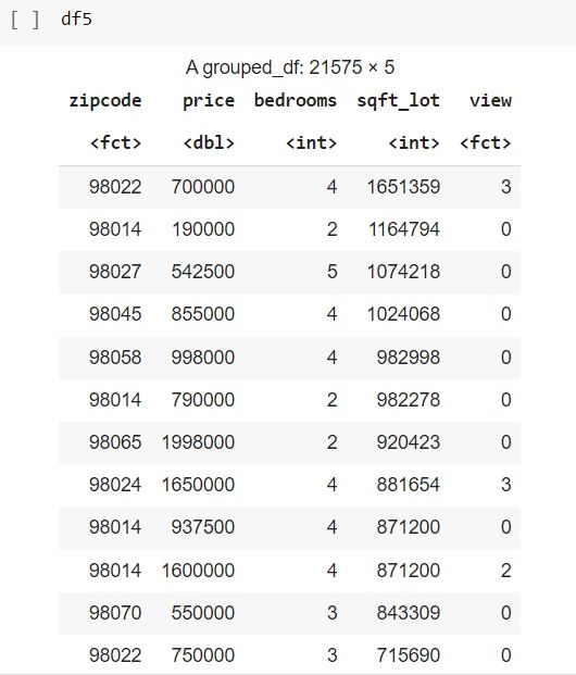
Through the analysis, we divided the area (zipcode) as urban or rural.
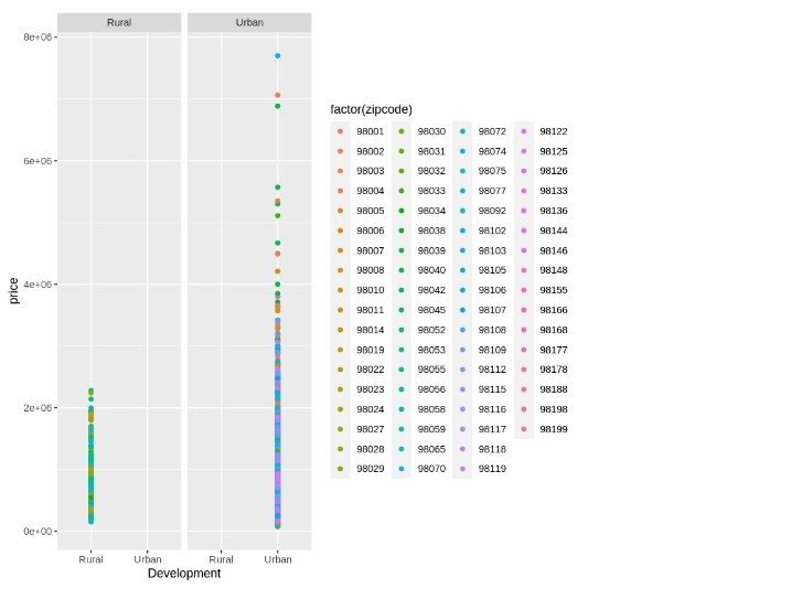
- It was found that, the house price under Urban area category has higher price compared to those in rural area.
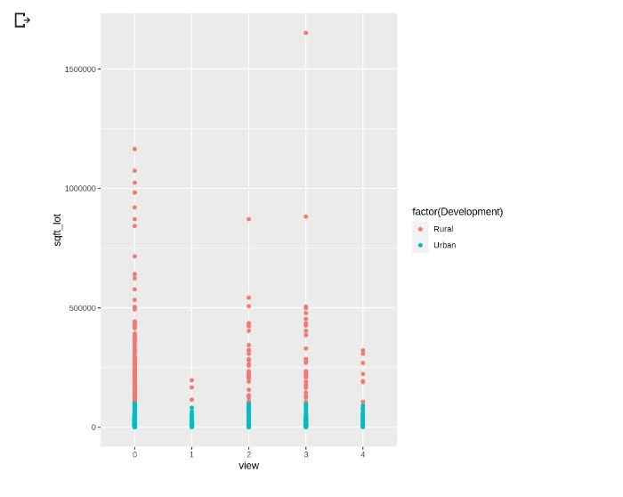
- However, from the analysis, we found that the size or area of the property in rural area is much bigger than those in urban area
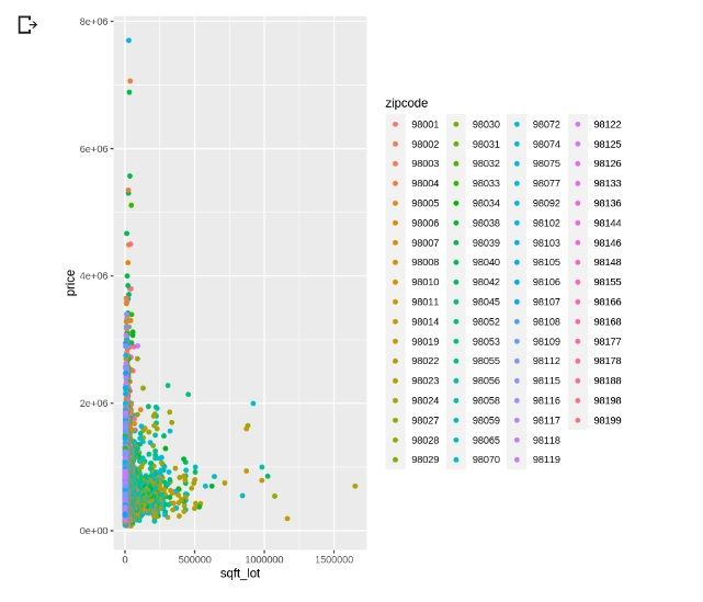
- Based on this two factors (the size and the area), we found that those house in rural area with larger size (sqft_lot) has much lower price compared to the smaller house in an urban area (higher price)
Further analysis could be retrieved here: link text
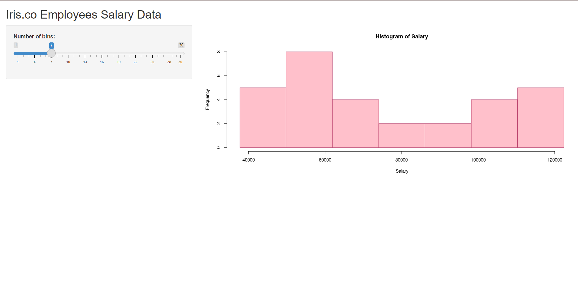
Hi, we are from Iris Group. Our dataset is about the salary of 30 employees in our company. After analyzing and exploring the data, we used a histogram to visualize the data. For the ML algorithm, we chose Simple Linear Regression as our data only consist of 1 input, 1 output, and both column in continuous numerical data.
To view the histogram:
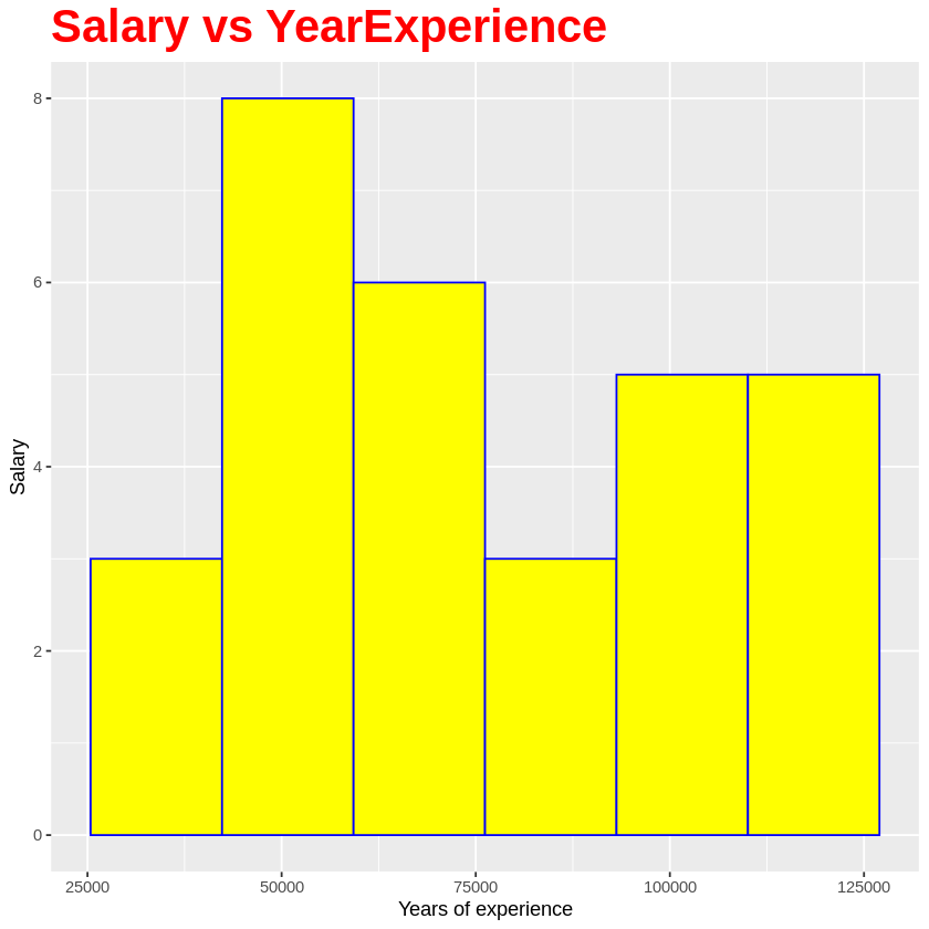
To view the RShiny App:
Group members:
Noor Anis Nabilla Binti Ismail
Nursyafiqah Sharmeen Binti Hussin
Ummilia Balqis Binti Harun

Thank you for teaching us, Dr.Sara. We really enjoyed the course and learned a lot of new knowledge! 
Group: Pfyzer
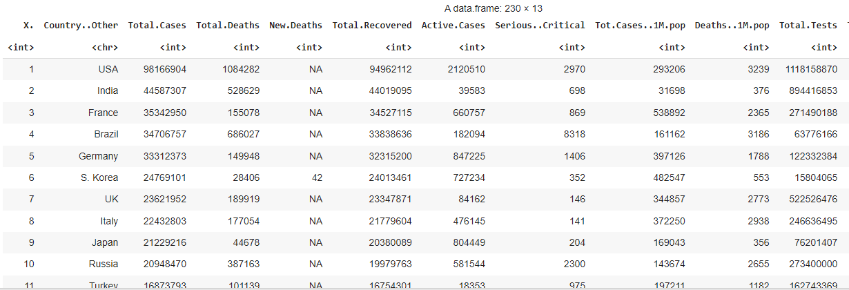
Our project title was "Covid-19 Total Case Prediction." The objective of our study is to analyze the total cases of Covid-19 from total death, total recovered and active cases all the countries, so that we can predict Covid-19 cases in the future. Our data consist 230 rows, and 13 columns. Below shows the data frame for the study.
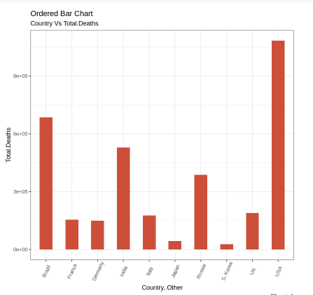
We visualize the data using ggplot. For example, we use ordered bar chart to analyze the relationship between country and total deaths. Below shows a few countries with their death cases.
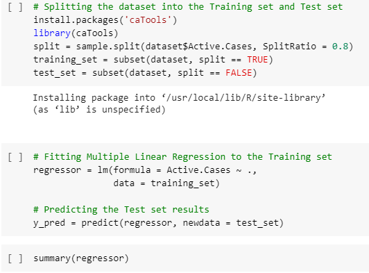
For Machine Learning (ML) algorithm, we use Multiple Line Regression because has more than one numerical input.
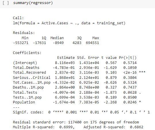
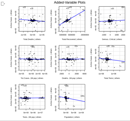
That's all I can share. My friends and I really enjoy joined this programme because we were trained by the professional trainees. Thank you so much Dr. Sara! Stay safe always 

Hi! We are from Pfyzer Group. Our findings on analyzing the various real time Datasets of Covid-19 Live cases.
- Our data is about the prediction of Covid-19 total cases. The total cases of Covid-19 including the active cases, total death and total recovered all around the world. As following below shown the data frame of 230 rows and 12 columns:

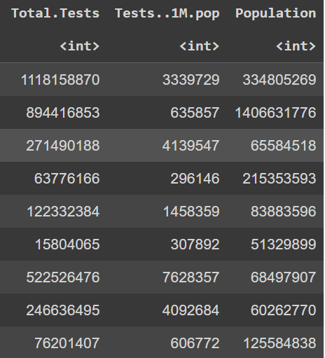
- We visualize our data by using Box plot GG plot such as Bar Chart, Lollipop Chart, Line Plot and Scatter Plot. Below is one of the example for the chart:
Lollipop Chart
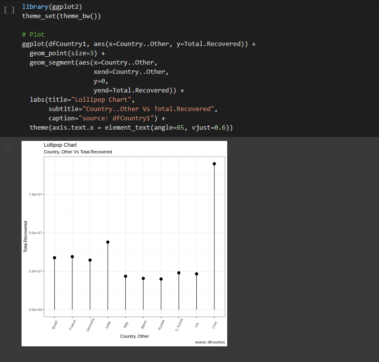
Observation: The United States of America (USA) has the highest total recovered of Covid-19 cases among the top ten countries analysed.
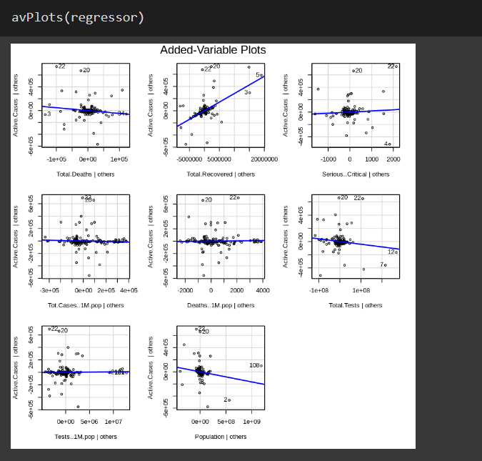
- Machine Learning algorithm that we used for analyzing our data is Multiple Linear Regression. The reason why we used the Multiple Linear Regression is because the data are more than one independent variable and one dependent variable are present. Simply we can say that when the data frame have more than one input and has one output of numerical data. Visualize the results is shown below:
Dataset : full_data.csv
1. Understanding the data
As no description was provided following the dataset, we begin with establishing our general understanding about the dataset and identifying the input and output variables:-
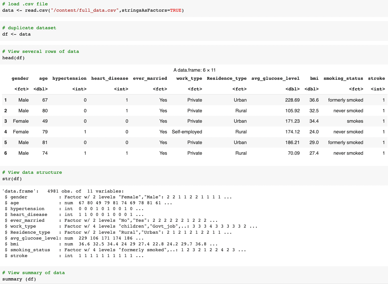
We pay attention to:
-
number of columns and the names -> what the data is about and how many variables we going to analyze (prep our mind with the degree of complexity we are going to handle 🥶.)
-
data type of each columns -> which columns should be the input variables, and which should be the target output. Also give an idea about what kind of prediction should be performed..is that regression or classification problem?
-
number of rows -> how many samples we had
From this undertaking:
We learned that this dataset has 4981 rows and 11 columns labeled as
gender, age, hypertension,heart_disease, ever_married, work_type, Residence_type, avg_glucose_level, bmi, smoking_status, stroke.
-
Thus, we assumed this dataset was from a 'health' sector and was sampled from 4981 patients.
-
We deduced that this dataset collects 10 parameters (input variables) on patients with and without stroke (1 output variable or target).
-
As such, we going to do a stroke prediction based on the classification problem.
2. Data Cleaning
At this stage, we aimed to ensure our data is consistent across the dataset:
-
no missing data
-
appropriate data type and values (E.g: age, avg_glucose_level,bmi shouldn't have negative values )
-
consistent format (E.g: gender should be either 'Male' or 'Female' only, not a mixture of other representations 'F', 'male', etc)
self-explain label -
relevant (no unique values like ID number, names, etc)
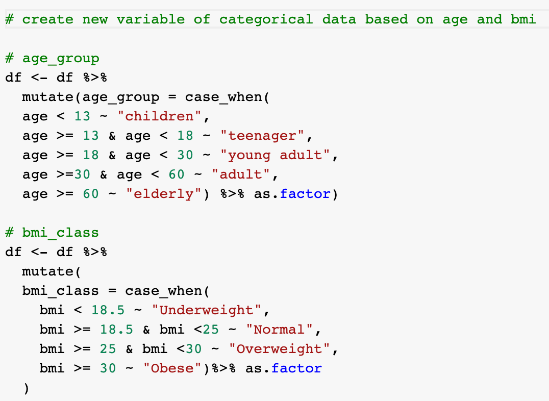
The given dataset is actually pretty clean and met the above-mentioned criteria. The only amendment we did was changing the data type of hypertension, heart_disease, and stroke from integer to factor as these variables tell whether the patient has the illness or not (yes/no).

3. Exploratory Data Analysis
This stage aims to provide the descriptive (what happened) and diagnostic (why it happened) analysis. We approach the EDA by categorical data, numerical data, and combination of both to understand the relationship:
Categorical data


Distribution of samples by each category:
-
most of the sampled patients are married, working at private sector, has neither hypertension nor heart disease.
-
the sampled patients are almost equally distributed by gender(male or female) and type of residence (rural or urban)
-
majority of the sampled patients are non-smokers (either never smoked or formerly smoked).
Numerical data

Range of each variable:
-
The age of sampled population of patients are 0<aged< 85, with most are between 40-60 and ~ 80 years old.
-
The sampled patient bmi are normally distributed with center ~30 (most of the patients have weight issue).
-
The glucose level skewed to the right with obvious 2 peaks at ~100 and ~200 glucose level (most of the patients have high blood sugar).
Understanding the relationship
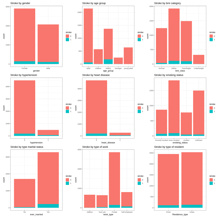
Graphs show the number of patient with and without stroke for each factor.
Here we can see the amount of those who have had a stroke is a small portion as compared to those without stroke. In other words, we have imbalanced data with a significant lack of data for patients with stroke.
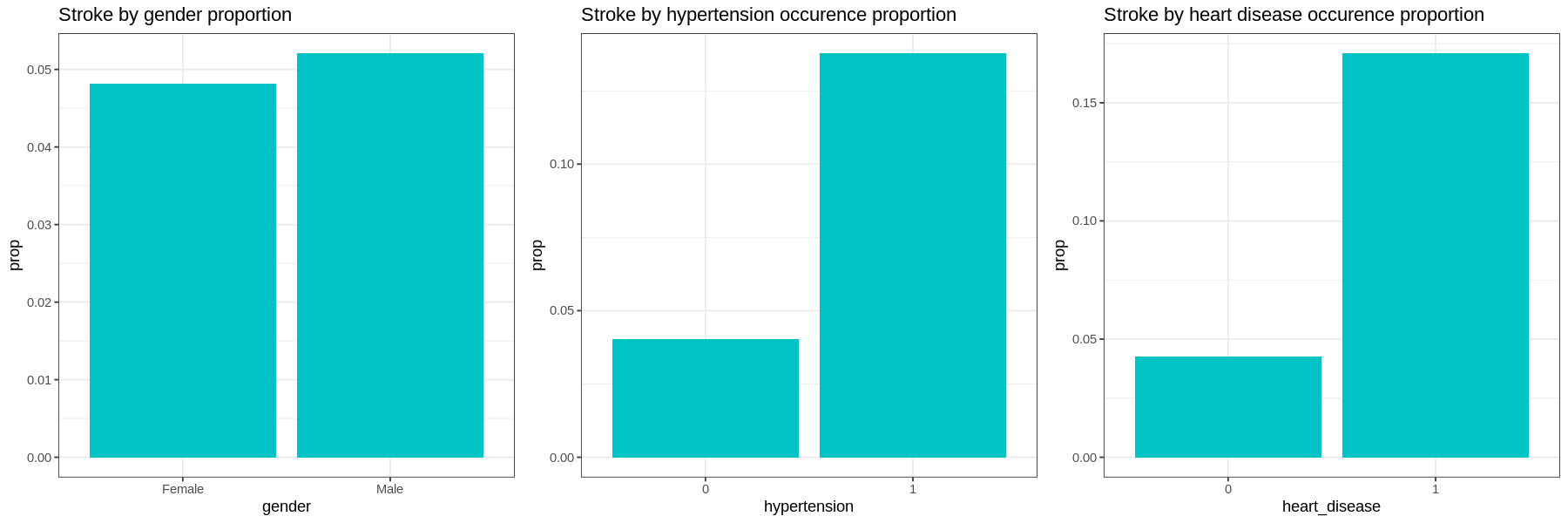
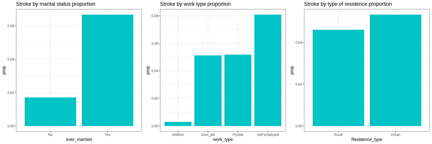
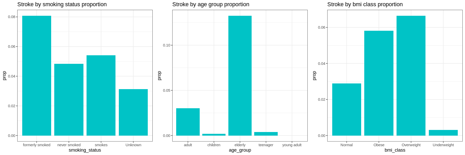
Graphs show the proportion of each factor for patients with stroke:
-
Gender and residence type does not appear to have much difference in occurrences of strokes.
-
Those with hypertension, heart disease, or those who have been married have a much higher proportion of their populations having had a stroke.
-
In terms of work type, Children have very low occurrences of strokes. There is little difference in the proportions of those who work in government and those who work in the private sector. Self-employed have a higher proportion of having strokes than other sectors.
-
Current smokers have a higher proportion of their population having had a stroke than those who have never smoked. Former smokers have a higher occurrence of strokes than current smokers. Those with unknown smoking have a low occurrence of strokes.
-
Elderly at age group has higher proportion of having stroke, followed by adult group. Interestingly, occurence of stroke in children is higher than young adult.
-
The proportion of stroke patients that are overweight and obese are high as compared to other bmi class with overweight slightly higher than obese patient. Those who have strokes very seldom are underweight.
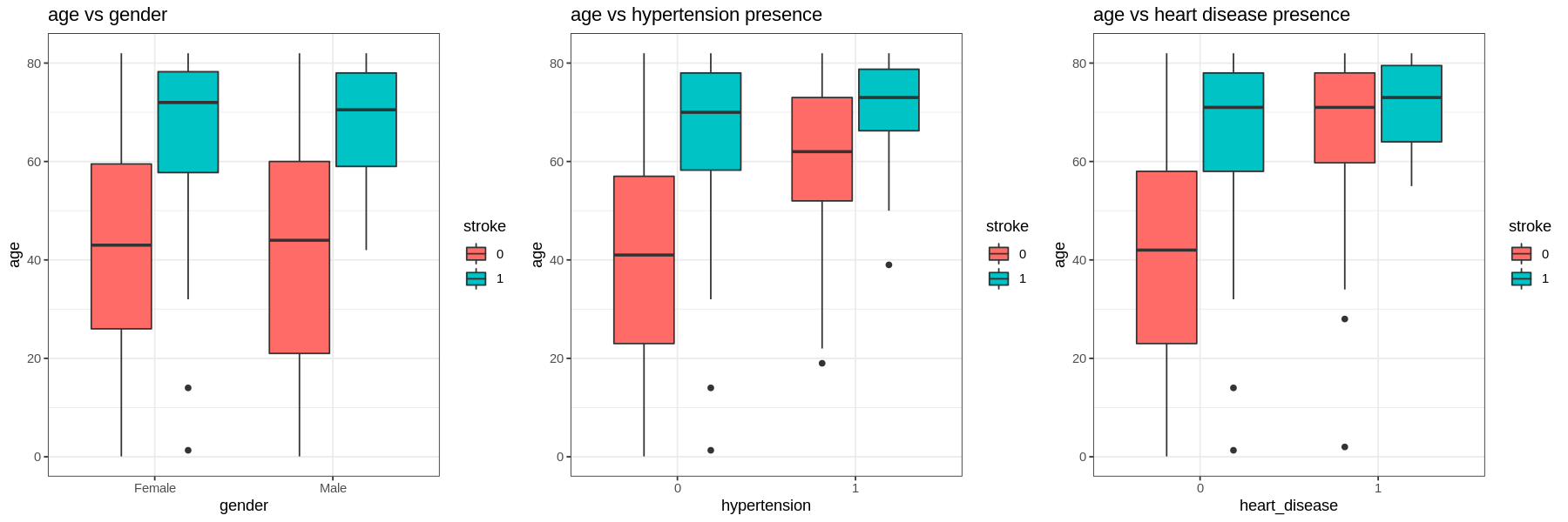
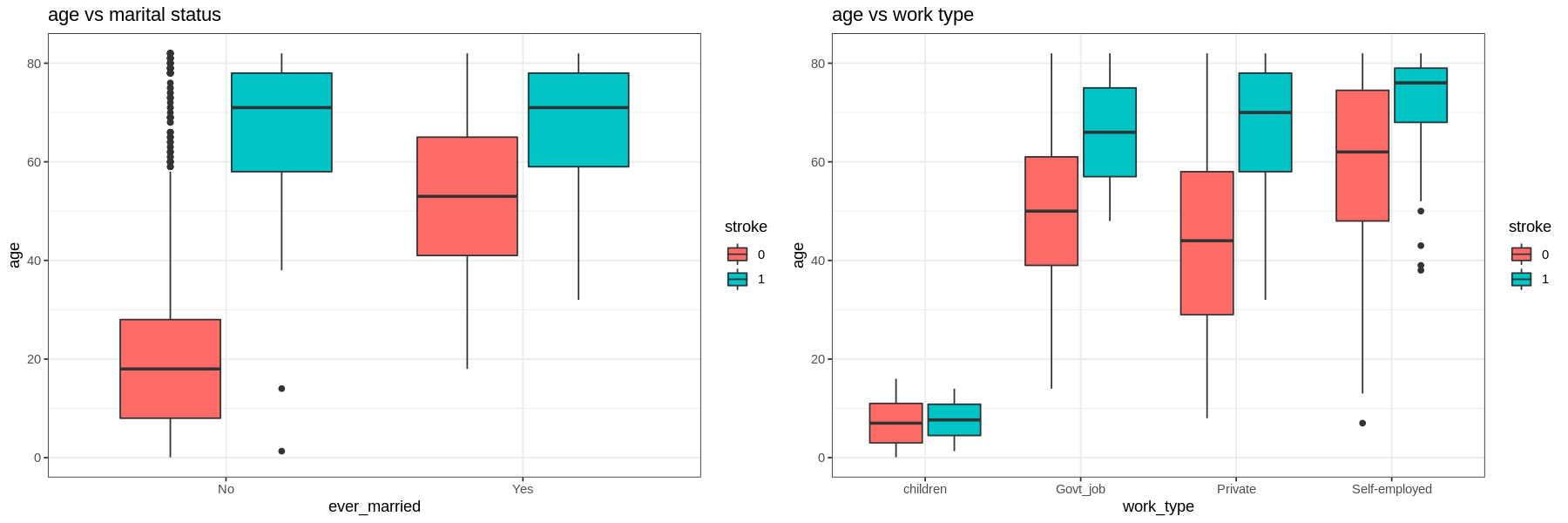
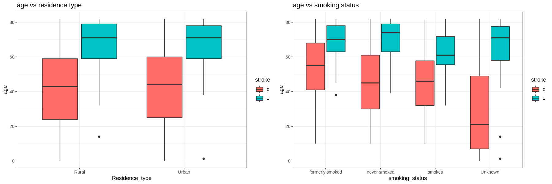
Next, we analyze each factor by age, average glucose level, and bmi.
-
For all levels in each factor those who have had a stroke are older.
-
Those with hypertension and heart disease are older than those who do not. Self-employed are also older than the other types of work.
-
Those who had a stroke and smoke are younger than those who quit or never smoked (but still had a stroke).
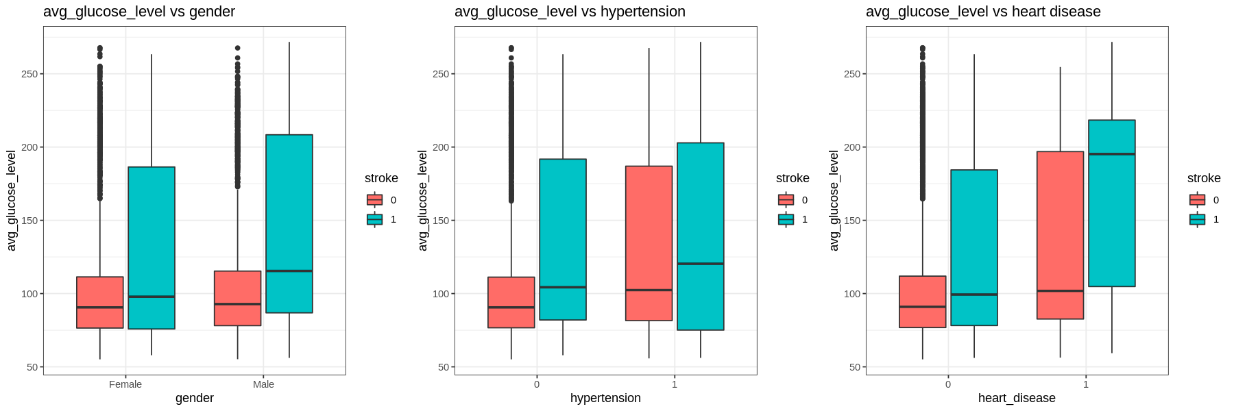
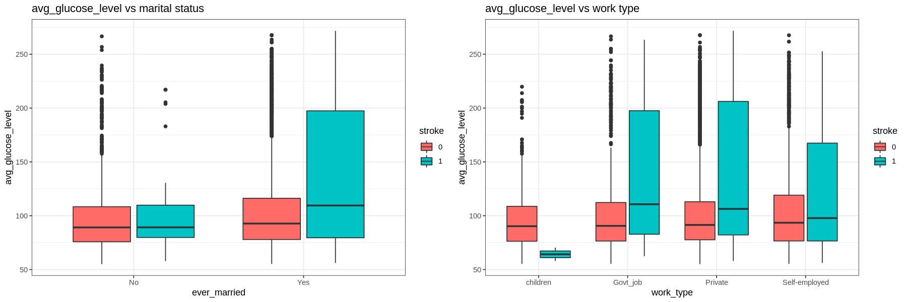
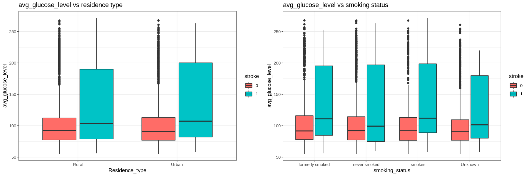
The average glucose level is right skewed.
- The IQR tends to go higher for those who had a stroke. Those with hypertension and heart disease have higher glucose levels regardless of having a stroke or not.
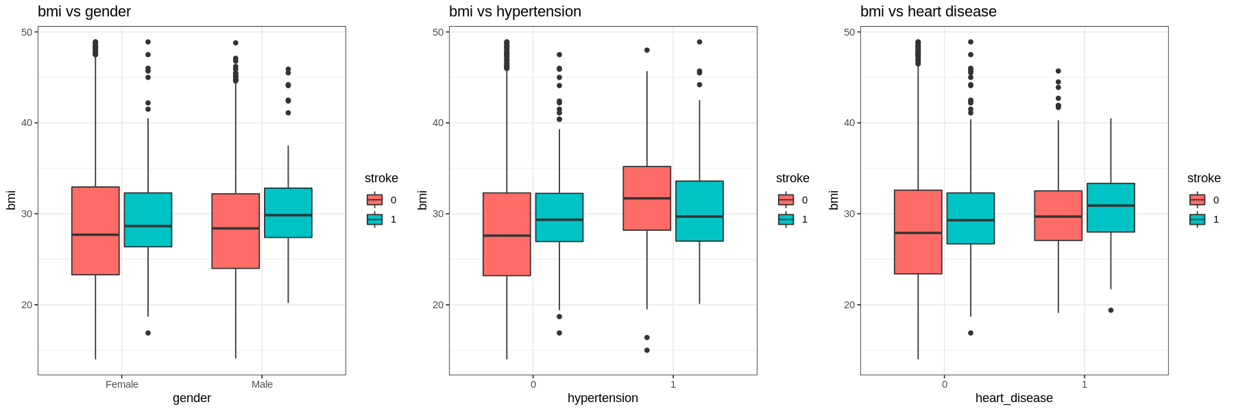
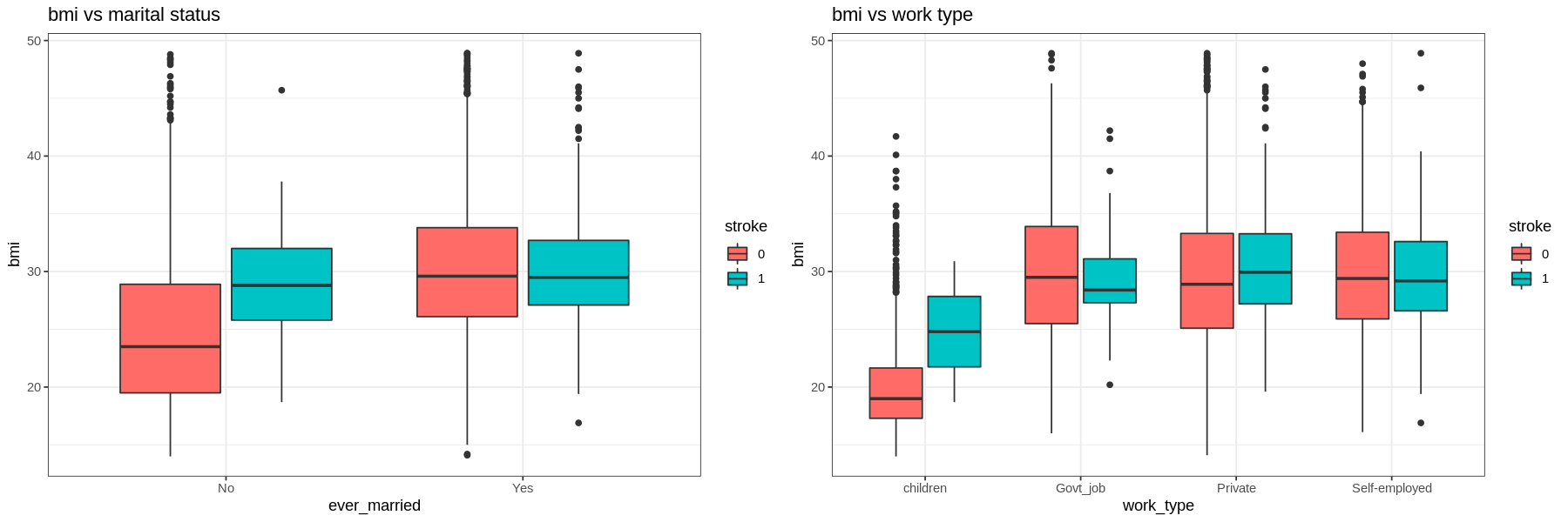
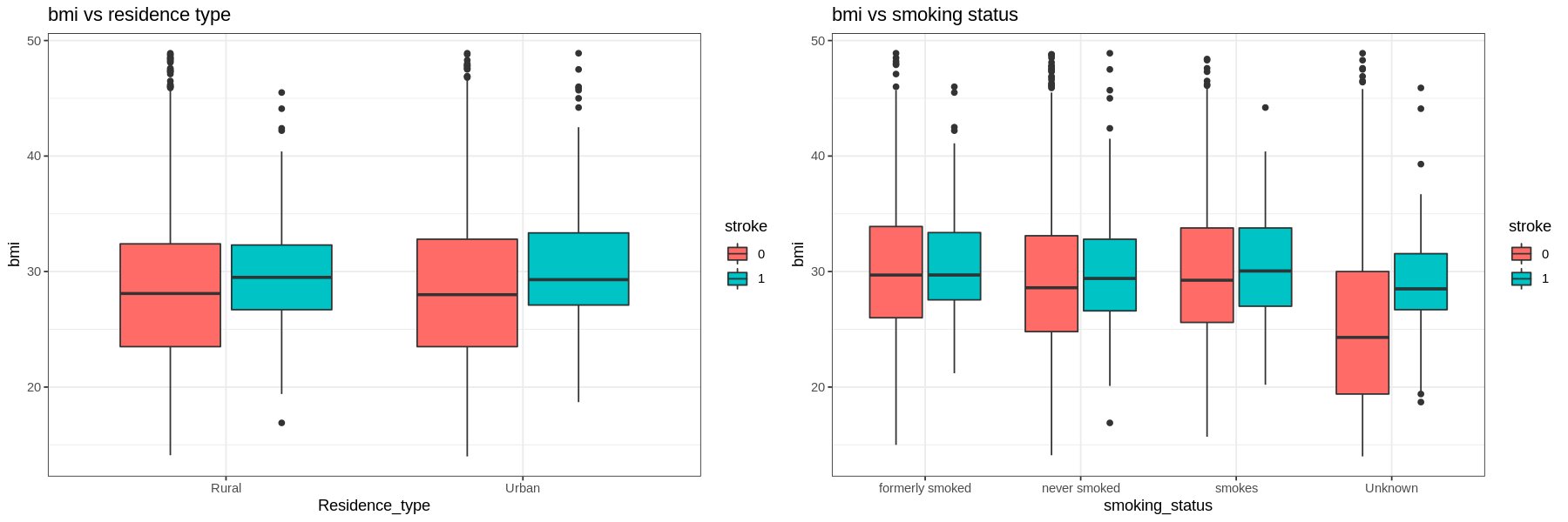
The graphs show that there is not much difference in the BMI of those who had a stroke and those who had not.
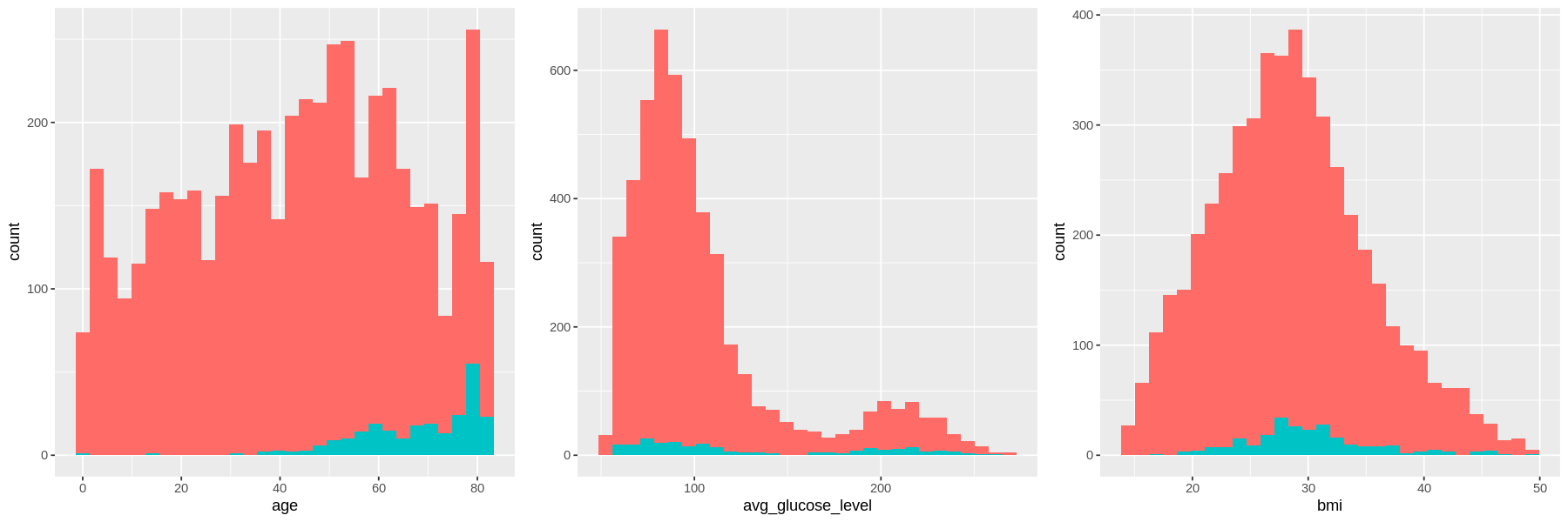
As age increases, the amount of strokes increases.
The distribution for average glucose level is bimodal for both stroke and no stroke populations, with peaks at the same values. However the density of strokes at higher glucose levels is higher than the density of no strokes at the same level.
There is no difference in the distribution of bmi between those who have had a stroke and those who have not..
4. Machine Learning
Split dataset to training and testing set by 80:20

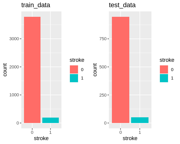
1) Logistic regression

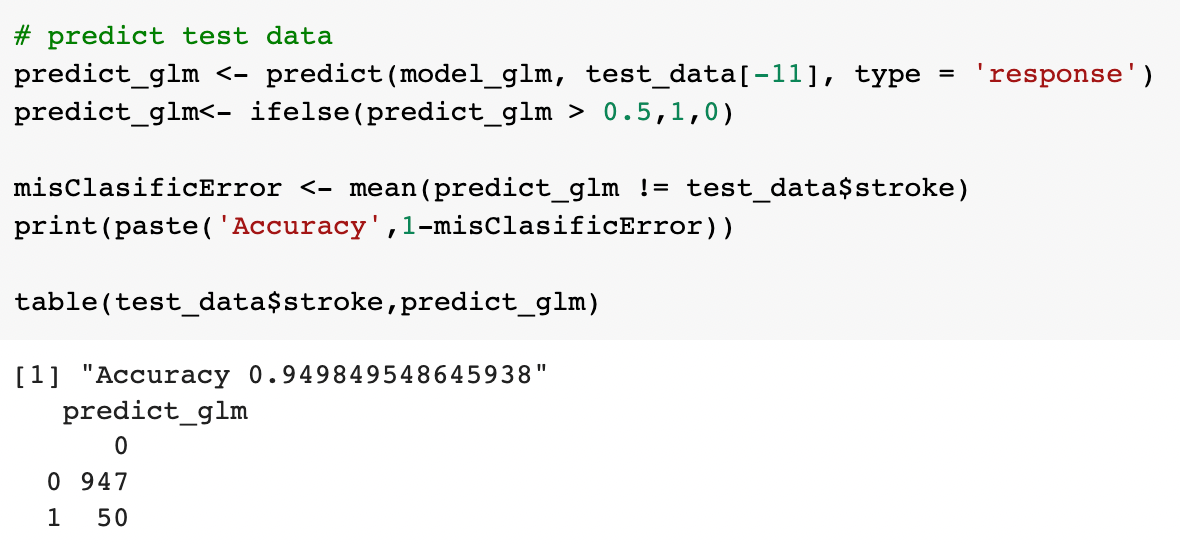
2) Decision tree
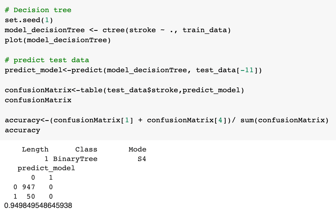
3) KNN
Group: HADA
Dataset: exams
The data we working out are exams.csv that contains score data for completed tests.
Understanding the data:
From data exploration mode, we can define that :
• gender : gender of the student
• race.ethnicity : group the student ethnicity as Group A to group F
• parental.level.of.education : define the parent level of education of students
• lunch : The type of lunch take by the student
• test.preparation.course : The status of test prepartion course of the student
• math.score : The mathematic test score of the student
• reading.score : The reading test score of the student
• writing.score : The writing test score of the student

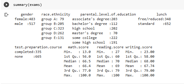
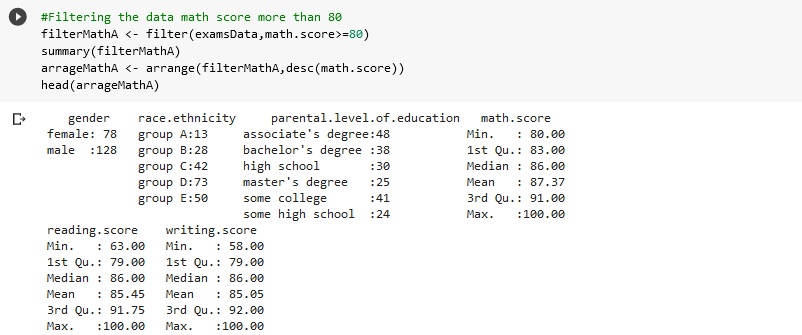
Data Cleansing & Analysis:
We filter the data for math.score that more than 80
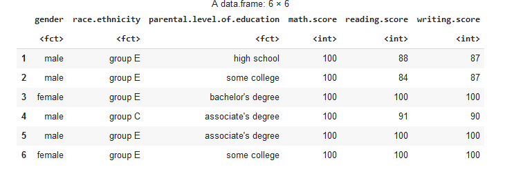
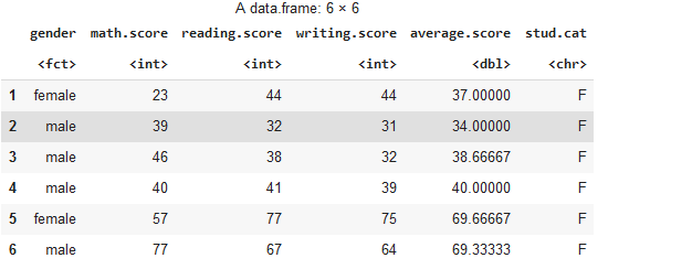
next, we create new coloumn of average student and their categories based on average score:
Machine Learning:
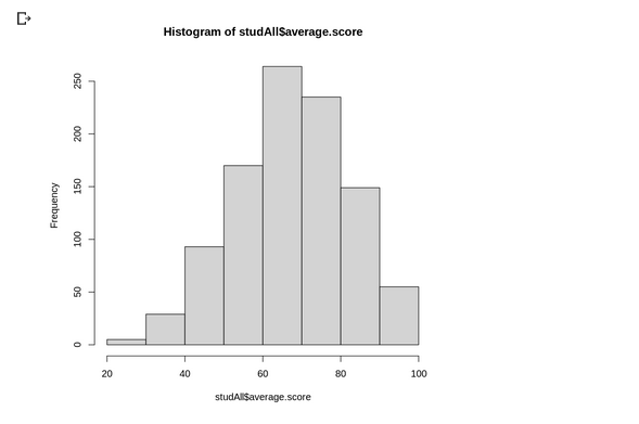
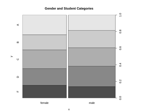
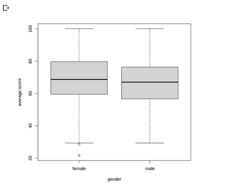
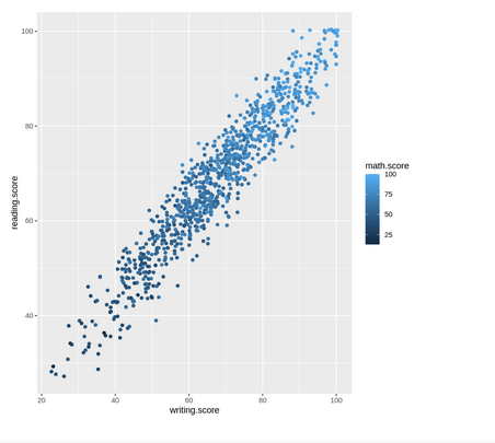
After analyze and explore the data we visualize the data :
Group name: MOMO
Our data is a large data set of different types of cars across the American market. We are required to model the price of cars with the available independent variables.
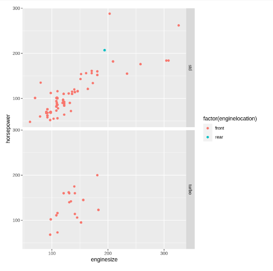
From the data we can see that the horsepower and engine size, positively affect the price of the car. As the horsepower and engine size increasing, the price of the car will also increase.
After that, for machine learning, we used the multiple linear regression because our data has more than 1 input and has a numeric output or target.
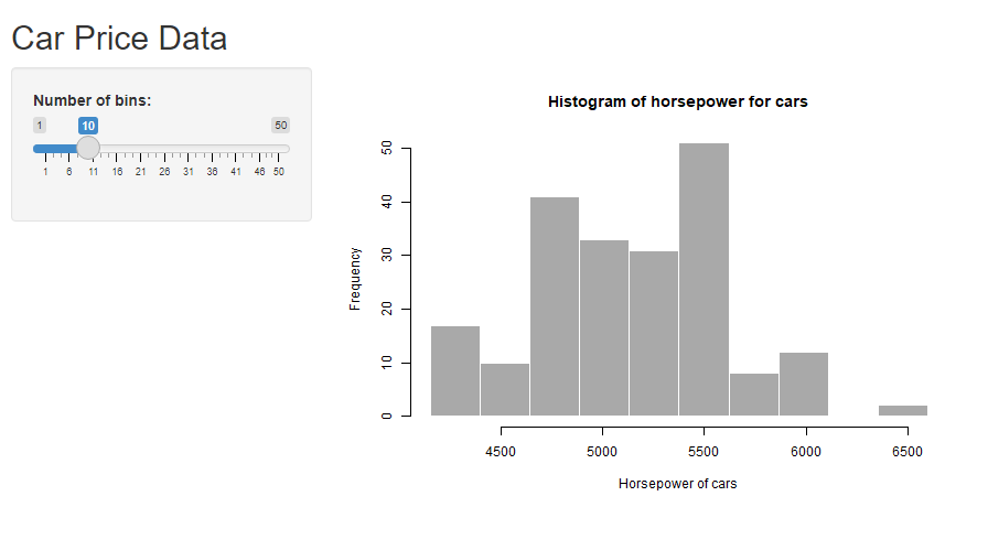
The above figure is our histogram chart that was created using R Shiny.
